 Ammar Ali
A visitor lands on a service page and spends two minutes reading it. They leave without getting in touch. It is tempting to decide the call to action was the problem, but you do not know that yet. Maybe they could not tell whether you serve their area. Maybe they needed an example of work like theirs, or the form asked for more than they were ready to share. Those problems need different fixes.
Start with a page that already gets relevant traffic and an enquiry that would be useful to your team. For a dental practice it might be a request for an initial appointment; for an equipment supplier it might be a quote request with a model number and quantity. An email address collected from a download is not the same thing as either. Decide what progress looks like for each kind of visitor before trying to increase a conversion rate.
1. Write service pages around what people came to decide
A visitor who searches for “commercial air-conditioning maintenance in Bahrain” should not have to click through a general facilities page to learn whether you maintain commercial systems. The opening should say what you do, who it is for, where you work and what the first step involves. Follow it with the details that let someone decide whether to proceed: what is included, where there are limits and what you need to give a firm quote.
Be specific about the decisions your team can explain: whether you handle ongoing contracts or one-off jobs, whether a site visit comes first, or whether you work on equipment from particular manufacturers. If a price depends on site conditions, say what changes it instead of publishing a misleading starting figure. In Bahrain, check that your Arabic and English service pages answer the same practical questions rather than treating one language as a summary.
2. Put social proof where someone needs reassurance
A testimonial has more value next to the doubt it answers than in a rotating set of generic compliments. Beside a maintenance service, a specific, approved review about communication during a repair is more relevant than a long list of five-star ratings. Alongside a consultation button, a genuine comment about a clear first meeting may be more useful than a client logo without context.
Use only real quotes and approved attribution. If you are starting without testimonials, show what you can substantiate: the named person responsible for the work, a current and verifiable credential, a relevant photograph or a clear explanation of the process. Don't invent reviews, put rewritten praise inside quotation marks or use a headshot that makes an anonymous quote look attributed.
3. Show what your work looks like, not just who hired you
A useful case study tells the reader what was hard, which decisions you made and what changed in the thing you delivered. A screenshot can show how an archive is organised or how somebody filters a catalogue. It cannot show whether enquiries rose. Where reliable outcome data is available and approved for public use, explain how it was measured and over what period. Otherwise, describe the feature and what it is designed to help people do.
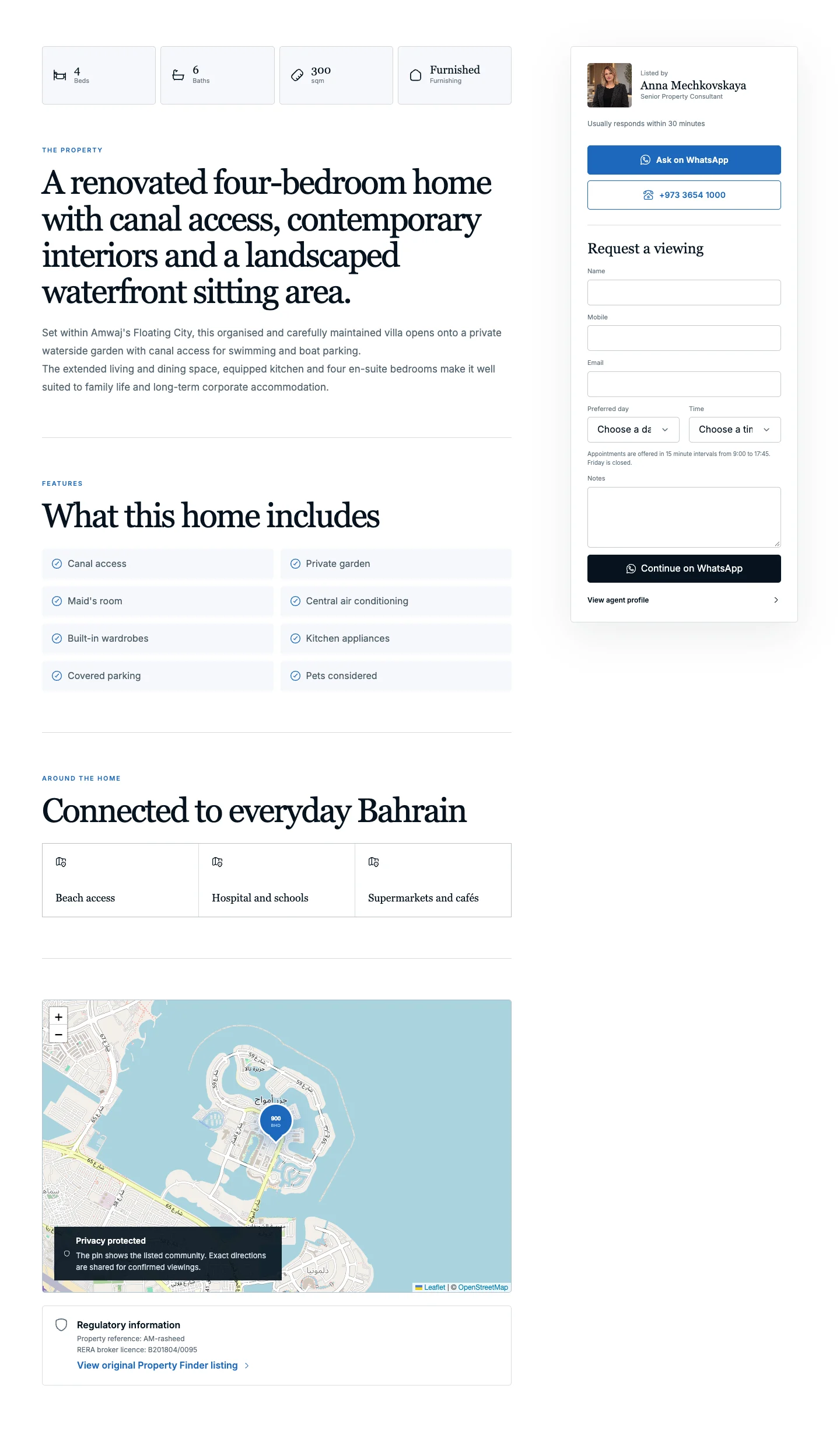
Bassam Al-Dawadi’s public site offers a useful example for a personal biography site. The Arabic homepage gives visitors separate routes into filmography, press coverage, and documents without asking them to understand the structure of the archive first. That is a visible design decision. It is not evidence of more collaboration requests.
4. Offer a resource people can use before they contact you
Not every visitor is ready for a call. Give early-stage visitors something that helps with a decision they are already making. An industrial supplier could offer a one-page equipment quote checklist; a website agency could offer a worksheet for listing the pages and features that must survive a redesign. Make it narrow enough to use immediately rather than calling a generic brochure a guide.
Choose whether email is necessary. If a short checklist answers a common question, publishing it openly might be more useful than asking people to register for it. If you send a resource by email, explain what the person will receive and ask separately about optional marketing. Keep the direct enquiry route available. Someone who is ready to talk should not have to download a PDF first.
5. Answer the questions people ask before they buy
The questions your team answers repeatedly are often better material than a generic FAQ. Ask what prospects need before requesting a quote, what they tend to misunderstand, and why suitable customers put off a decision. Answer those questions beside the relevant service, then write a separate guide only if the subject deserves a fuller explanation.
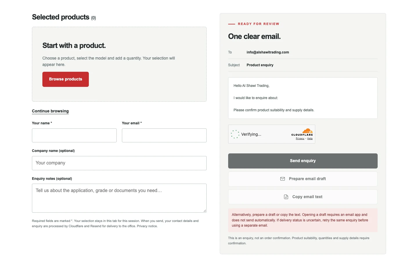
Al Shawi Trading shows how this can work in an industrial catalogue. Its public site lets buyers start by category, brand or model. It also shows them how to check manufacturer documents and prepare an enquiry with model details, quantities and notes. The guidance goes with the actual buying decision. It does not need to sit in an unrelated advice section.
6. Test the call to action and the contact form on a phone
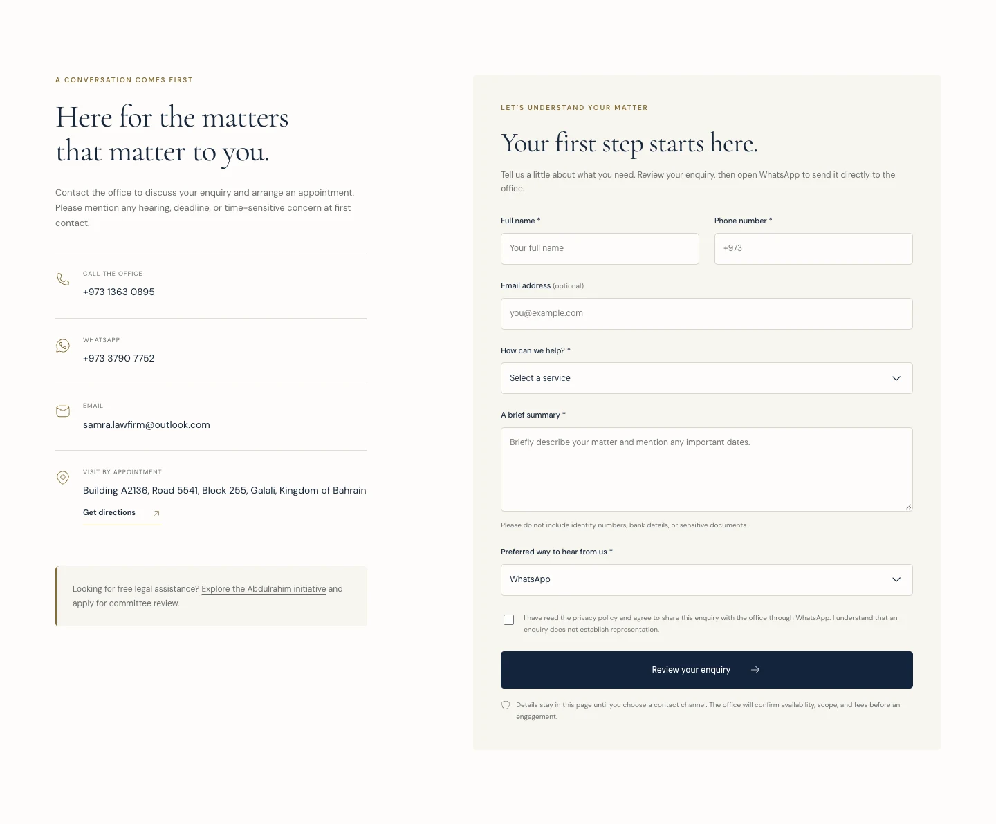
Say what the button does: “Request a site visit”, “Ask about this model” or “Book an initial consultation”. “Learn more” is not a useful label for a button that opens a contact form. A WhatsApp option can be convenient, but give people another route if their request is long, includes technical details or they would rather not use WhatsApp.
Keep required fields to what you need to reply and route the request. Leave detailed questions optional unless they truly affect the next step. Test with one hand on a real phone, in both site languages. Check that errors are visible alongside the relevant field, keyboard controls work, and users see a confirmation only after the form has genuinely accepted their submission. Test that the message reaches the right inbox as well as how the form looks.
Example enquiry path
From a website visit to a sent message
A WhatsApp button opens a conversation, but it does not send a message on the visitor’s behalf.
- The browser loads the page
Website hosting delivers the page to the visitor’s browser.
- The form prepares a draft
The visitor fills in the form. In this example, the browser uses those details to prepare the message.
- WhatsApp opens
The visitor taps the button and WhatsApp opens with the prepared draft.
- The visitor sends it
The business gets the message only after the visitor presses Send in WhatsApp.
An email or CRM form works differently: it needs its own submission service. A WhatsApp button click does not confirm a sent message.
7. Say what happens next, then follow through
Unclear follow-up makes a small decision feel larger. Explain who replies, how quickly they usually respond and what the first conversation covers. If an initial meeting is free, or a quote is not binding, say so only if that is how the business works. No need to suggest availability, price or a deadline you cannot commit to.
MaroonDM's public strategy-session page tells visitors that someone reviews the request, responds and arranges a meeting if there is a fit. The promise only helps if it reflects how enquiries are handled. Assign someone to check the inbox, give them a way to cover absences, and make sure the team can see what a visitor already told you so they do not have to repeat it.
8. Track enquiries you received, not just buttons people clicked
A WhatsApp click means the link was opened, not that a message was sent. A telephone tap does not confirm the call was answered. A form start isn't a submission. Separate these signals in your report. Measure confirmed form submissions once and use a simple shared enquiry log to record actual messages and answered calls, along with whether they were relevant and what happened next. Avoid putting personal details or message text into events.
For an illustration, imagine that a service page generates 20 contact-button clicks, seven actual enquiries and three that meet the service and location requirements. Those imaginary numbers answer different questions. The gap before the seven tells you to check the handoff from button to contact. The gap after it tells you to check how clearly the page explains who the service is for. Start with one page, fix the most likely barrier and compare consistent periods alongside the number and quality of enquiries. A small number of visits can suggest what to investigate, not prove that a change worked.
Where to begin: Choose one service page that attracts the right people but gives them a weak next step. Add the missing decision detail, place real proof near the contact button and make sure the enquiry reaches someone who can act on it. If you want help choosing the page to start with, request a strategy session.
Put this into practice
Read the guide to Local SEO in Bahrain. Protect search traffic during a website redesign.